Im so dead
I was just thinking i could get you all to sound off maybe on what you think is nice
PLEASE COMMENT ON WHICH YOU LIKE BETTER!
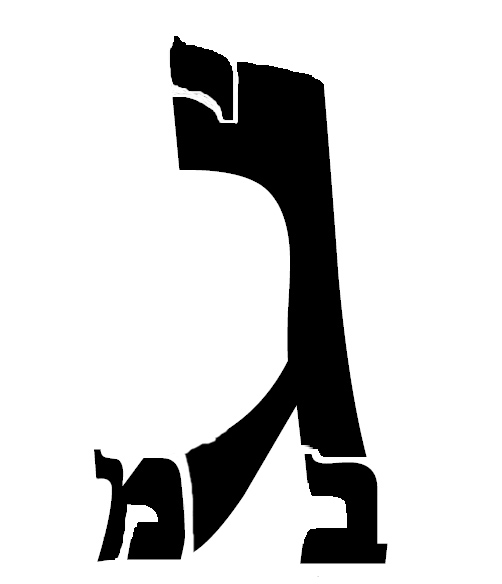
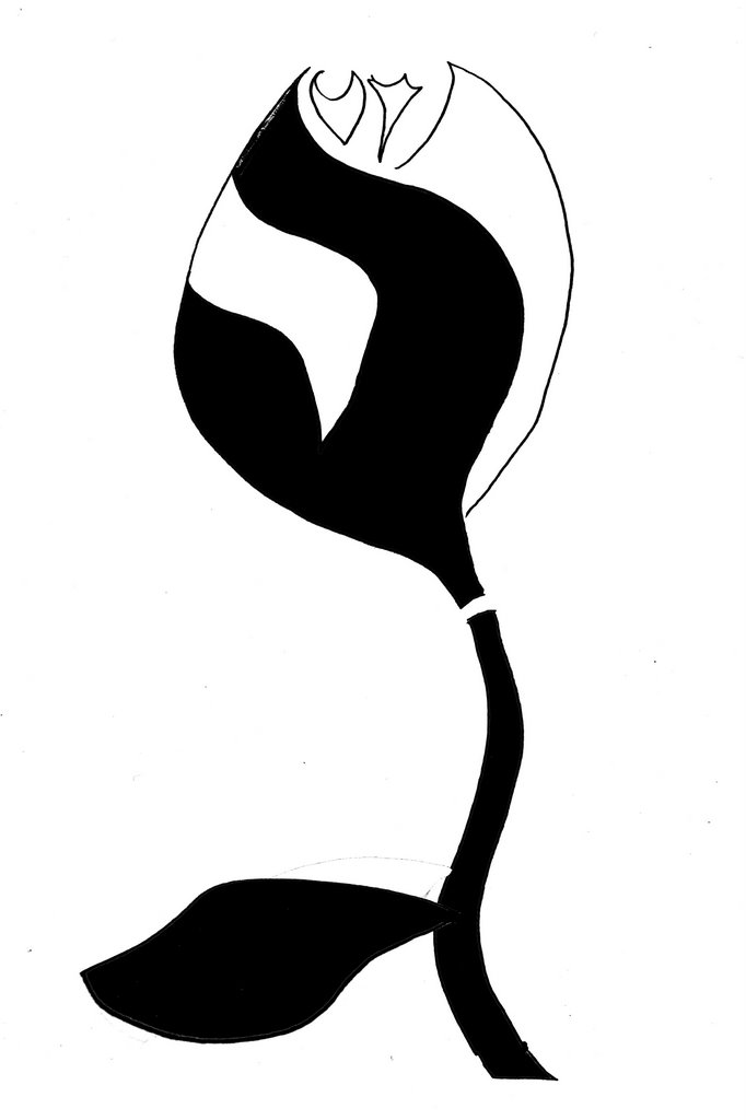
The flower has The Gimmel, Bet and Yud but no Mem
posted by FFD at 5:39 PM
![]()
![]()
Just some guy blogging about his life as a Pre-med/soon to be married/orthodox Jewish.......guy. Im "just some guy"
posted by FFD at 5:39 PM
![]()
![]()

10 Comments:
Posting on instructions from FrumDoc...
It doesn't matter what order the letters appear in, though the Gimel should stand out more if any will.
The first one is boring. Nothing to it.
Second one is okay, missing a letter - depends how much the FFW cares. Make a fancier flower or put it into a pot or vase, you can get every letter in. Might look much better if colors were reversed.
A likes the top one, R likes the bottom one, as long as FFW doesn't mind the missing letter...o and speaking of invitaions...we got two seperate vort e-mails, and since we doubt that you'll send two (or none if each of you assumes that we're on the other's list...how ironic!) we guess it's time for you guys to decide who lays claim to us as a couple, as far as the wedding list goes anyway :)
P.S. FFD, why are you "so dead?"
so heres the next Q: assuming i could put in a mem in the other part of the flower (which i can, ive tried) does it matter that that mem would be out of order. Meaning FFW's name should read bet then mem, not mem then bet. I guess my Q is does the order matter or as long as all letters are there. oh and btw i made them both
HIOOOOOOO,
I def like the second one much better ezzie is right first one is very blah. The second one is more weddingy. ZOOM ZOOM ZOOM,PO
I definitely like the second one, but does it really make a difference what we say/think we all know who gets the last say
The second is a more unique image, and the "squarer" feel looks warmer.
This conversation may be totally moot by now but I'll put my vote in for the first one. Much cleaner looking, classier. The gimmel stands out at you immediately (I'm guessing that's the last name?). I generally like the monograms where you don't have to find the letters between extra lines that are there to complete a picture.
no such thing as a moot point on my blog all comments are always welcome as are all people. It seems to me that the consesus is that the guys like the second and the girls like the first. WHich is wierd to me because i thought the second was more artsy. but it appears that Women are less spacially oriented. they seem to find it annoying to "look for" the letters, whereas most guys see it right away. Just another difference im learning about guys and dolls
Cool guestbook, interesting information... Keep it UP
» »
Very nice site! Yahoo email marketing Acuvue contact lenses.html Search engine optimization mashhad Interline cruises to panama Upskirt club Medikament lamictal Prescription celebrex line 5 row bras Home security systems and cellular phones homeland security 01875 observation system w b Volvo c70 turbo Banston ford frisco Charlotte church huge tits dimenec pomes about baseball
Post a Comment
<< Home